
we will remember…. these truths…
The Gearbox Gallery Artist Dennis Hanshew’s Presentation February 29, 2020, 2-4 pm
I gave an “artist’s talk” at the gallery with an audience of about twenty-five, many of whom were long time friends and many who are, also, distinguished artists. The conversation addressed my influences, motivation and process, all connected with a good deal of storytelling. This is an edited transcription.
***
This is a wonderful gathering of friends. Some of you go way back. I’ve known Nadine since…
1989.
Yes. Nadine is now with the Asian Art Museum in San Francisco.
Linda Fong is a very talented painter. Dorothy Faison is an extraordinary painter living in France now. I could go on. Yasmine is a fine attorney. If anyone needs a divorce, she comes highly recommended! [laughter]. Peter is a long time friend. His mom was a mentor of mine and I’ll be talking about her.
So I’m going to be talking about the art but I’m also going to be doing some storytelling. What I’d really like to do is have your questions and comments guide the conversation rather than me just doing a song and dance up here.
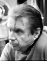
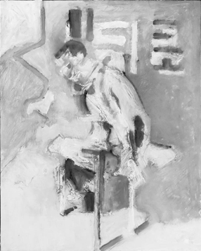
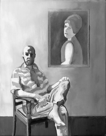
Is this a series of self-portraits?
So you recognize this as a self-portrait?
Yes.
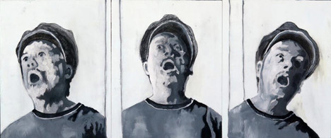
Oh, that makes me so sad! [laughter] So this is taken from a literary source, Steinbeck’s Of Mice And Men. It’s essentially a story of two character, George and Lennie. [I go on to describe the story and, in particular, the character Lennie]. Somewhere around 1970 I painted the first version of this. It was painted in encaustic, a hot wax medium, and it’s owned by the State of Hawaii. I wanted to paint Lennie and give the impression of him staring at something passing overhead; a bird, a cloud. I wanted to revisit this idea but I didn’t have a model to work with. The original painting was done from those little strip photos, where you would go into a booth and for a quarter you’d get a strip of images. I had forced all my good friends to go and do this for me and I had a bunch of the strip photos including some of my friend Brian who was a wild and crazy person. Just to give you an idea of how crazy he was, his parents were both Mill Valley psychiatrists! [laughter]. But I no longer have those photos so I took a whole bunch of photos of myself and then I put them into Photoshop. I work from photos. Most of the contemporary artists I know work from photos. It’s not like centuries past where artists were classically trained and you couldn’t be a painter if you didn’t know how to draw really well. A lot of artists today couldn’t draw their way out of a wet paper bag. We all use photos and I run mine through Photoshop and the filters to break the images down into value shapes, shapes of dark and light. So, for instance in the portrait of Daniel, the face is broken down into these shapes.
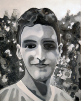
That is one kind of way I go with my painting. The other is much more painterly in that I am more interested in the brushstroke and how the paint is going onto the surface and I am not as concerned with the design per se, as in the painting of the father and son.
This photograph is really stunning. It’s really different from the painting but I understand the connection. It’s very Goyaesque. Have you ever thought of the photo side or printmaking side as your art?
For years and years I have taken lots of photographs of people; friends mostly. And I did have one exhibit in Honolulu of photos from my travels at the now defunct Ramsey Gallery. But I don’t generally think of my photos as finished art. And sadly, printmaking is a gap in my art education. I have done some linoleum and wood block prints but have never studied etching or lithography, for example.
I’m interested in your influences. Some of this seems to remind me of Francis Bacon.
Oh, yes, early on I was struck by painters like Francis Bacon and Lucien Freud and many other figurative painters. But as a painter having studied art history I can’t even begin to think of all the other painters that have influenced me, consciously and unconsciously. You’re a part of this continuum of art and artists that goes on and on and on.
If you don’t know this painting it’s by Titian, in the Prado in Madrid, a 16th century painting. It’s one of many versions of Venus.
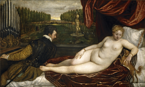
The original was a commission from a nobleman who wanted a quote/unquote “erotic painting.” Well, we’re talking the 16th century, we’re not talking about now but, frankly, I think it is one of the kinkiest paintings I’ve ever seen. Essentially, this is Venus and there’s this pipe organ guy staring at her “you know what” and she’s got a little lap dog licking her armpit. How much kinkier can you get then that? [laughter]. Anyway, I decided to do my own version and my version is just the portrait. I pulled her head out of the original and came up with this.
So I do take inspiration from a lot of different painters. Although there are only fifteen paintings in this exhibit, there are about thirty paintings in this series and several come from other painters; Goya, Velasquez, Hogarth as well as paintings derived from literary sources. There’s a painting of Dorian Gray from the Oscar Wild novel.
[Not a part of the discussion; however, Bow Down, the painting hanging in the window, is very loosely derived from Nightwood, a novel by Djuna Barnes.]
And, of course, the Steinbeck painting of Lennie, already discussed.
So this is about process. Some of the paintings have a feeling of color. There are some warm, cool grays for example.
All of these sixteen by twenty inch paintings are painted on wood panels. Usually I size them with white gesso to have a white painting surface but sometimes I paint directly onto the wood surface, either because I’m impatient or because I want the warmth of the wood color to show through in the painting. You can see that very evidently in the portrait from the Titian. In Pierre’s portrait the warm grays are due to the paints used.
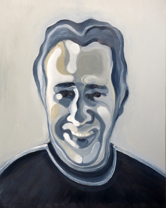
I met Pierre in 1974 on Diamond Head Beach when we were both young and cute. [laughter]. We’re both seventy-one now. The color in his portrait is from the pigment. Somewhere along the line I discovered Sennelier brand oil paints and the difference between them and what I had been using was like the difference between a Bentley and a VW. They’re like painting with butter. I think they may have a higher oil content. They’re luscious. You want to get into a bathtub full of them [laughter]. There is a huge range. So, for instance, in the blacks there are seven or eight of them. Same with the whites. There is a titanium white but also a titanium white buff that you see in Pierre’s portrait, the warm color in his forehead. Sennelier gave me more variation within the monochromatic scheme of this series. I didn’t want to go into real color.
Why not?
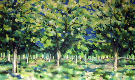
Ah! I had been working in color for many years and doing large paintings of orchards and trees. My mother was still alive and living up near Sacramento and I was often driving up there on I-80, passing all those orchards, a lot of nut tree orchards, almond and others. I began going off the freeway and driving along and through the orchards at seventy miles an hour with my window open and my camera aimed at the trees and I got some wonderful images of the trees that were [sound like “swish”] as if they were traveling.
And then there were singular trees. Eventually these paintings evolved into images of tree trunks. I was traveling and in a small town in Uruguay and the streets were lined with huge sycamore trees and I was fascinated with the organic shapes and colorations on the tree trunks and took tons of photos of them.
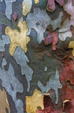
I began a series of paintings of tree trunks and Yasmine is the proud owner of this one.
Even though it is pretty abstract, you still see the edge of the tree trunk. That continued to evolve and went more abstract, nearly pure abstraction, although I don’t believe there truly is such a thing as pure abstraction. That continued to evolve and the reference to the tree trunk nearly disappears and the painting become more a matter of coloration and pattern.
There were ten or twelve of these paintings and they were hallucinogenic in color and the closest I have even come to abstraction. But then I ran out of steam. If you know about the American abstract expressionists of the forties and fifties, a number of them committed suicide and one of the suppositions is that they had run through their genre and didn’t have anywhere to go. How many drip paintings could Jackson Pollack have done had he lived to be an old man? Would he have evolved from his drip paintings into something else? I think somehow he had run it through and didn’t have anywhere else to go. I ran it through and didn’t have anywhere else to go and had, I suppose, the equivalent of a writer’s block. And so I went to the Internet and began looking around at photos of all kinds of stuff and came upon a photo of a man tied to a chair. To be honest I don’t remember if it was a scene of torture or if I found it on a porn site [laughter]. Anyway, the image struck me and I did a fast charcoal sketch on one of the wooden panels and I liked the boldness of the black and white so much that I decided to paint the painting in black and white and that was the first one of this series. It is in more of a painterly style, less in the design style of some of the others. I go back and forth depending on the subject. And it started to make me think more about black and white and there were a lot of things that informed me about black and white. One was film noir of the forties and fifties. I watched “Citizen Kane” without the sound on a flight on that little monitor on the back of the chair in front of me and realized that it was a masterpiece of dark and light value. You could stop frame it at any point and you would have a near perfect composition of values.
There is another story about black and white. See the painting of the gentleman smoking the cigarette?
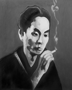
That was [Yasunari] Kawabata. He won the Nobel Prize for Literature I think in 1974 [I was way off, it was actually 1968]. I had gone through a period of reading Japanese fiction, post WWII. Coincidentally, some years after winning the Prize, he committed suicide. He didn’t leave a note but I think perhaps he had reached a point where he didn’t know where to go. He had won the Prize and had several world acclaimed novels. Where do you go after you’ve written a masterpiece?
I digress. I went to an Asian film festival and saw a film by a directer named Kumai, “The Sea and Poison.” The story was taken from a novel by the same name [by Shusaku Endo] that was derived from a true story of twenty-nine American airmen who had been captured and taken to a hospital in Japan. They were told they would be given thorough medical examinations and were then taken, one by one, to operating rooms, sedated and vivisections performed on them. Horrific things like seeing at what point a man died from having his lungs cut away. The film was in black and white and the operating room scenes were gut-wrenching, it was like getting punched in the face, because the rooms were all white, white walls, white tile floors, but the blood was black, flowing down across the white floor into a scupper and into a drain and swirling down. The director was there with a translator and at the end of the film I asked why he had filmed in black and white. He said he hadn’t intended to, that they had begun filming in color but when the got to the operating room scenes they simply did not have the impact he wanted. They tried animal blood and all kinds of things for the blood and finally someone suggested filming in black and white and that was what worked. His explanation was that we are so immune to blood and gore in technicolor on the TV and in film that it doesn’t have much of an effect on us.
So it’s a convergence of things. I like the boldness of black and white, it has a strong graphic quality. It’s easier to see the basic elements of a black and white painting as opposed to a painting in color. As a painter, a good exercise if you want to understand the values of a painting in color, is to photograph it and then transform it in Photoshop to a black and white image and sometimes it will go utterly flat. Certain colors register as dark. Reds generally are dark. Some other colors typically register as light.
Ron, did that answer your question?
Yes but your reasons not so much. [laughter]
Ron always says what he thinks and it’s one of the reasons I like him so much!
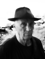
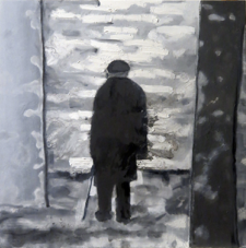
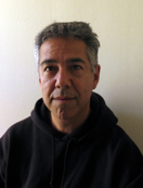
I want to talk about a couple of people. Mr. Allerton. I spent thirty years living in Hawaii. In the 1970s on the island of Kauai there is a valley called Lawai Kai. In the 1930s a man named Robert Allerton inherited a large fortune, something like 68 million dollars if I recall, a phenomenal fortune at the time. I want to say that Robert was in his fifties and he met a young architecture student name John who was, I believe, nineteen at the time. It’s pretty much certain that they had a gay relationship for the rest of Robert’s life although that is not much written about. Robert adopted John as his legal son and heir but in Chicago at the time it was problematic to live as a gay couple so they left on a long tour around the world and at a certain point they came to Kauai and found a 120 acre valley for sale for the huge some of $50,000! The valley originated at a waterfall that flowed as a stream and widened into a river that made its way over a perfect white sand beach to the sea. They bought the valley, built their house just up from the beach and a guest house some distance farther up the river. One of Robert’s fascinations was botanical gardening so he began developing formal botanical gardens with reflecting pools and fountains and sculpture acquired during their travels. I had been invited to the garden by a friend who was in a work/study program there. I met John Allerton who was in his seventies at the time. Robert had died long long before. One night my friend and I were walking in the garden under a full moon and we saw Mr. Allerton standing, leaning on his cane, looking out across the river flowing by and I thought, “Oh my god, what kind of memories must this man have?” He never saw us but that image of him was burned into my head but there was no photograph and all these years later I decided to do a painting. So I Googled “old man with cane” and “landscapes” of some sort and Photoshopped the figure into a landscape and that’s where that came from and how the painting was painted.
So we all have these things, right? [I pull my cell phone out of my pocket]. And these provide many valuable functions for us but this thing is going to be obsolete in three or four years and I’m going to have to pay Apple another $500 or more to get the newest version. Among other functions they are depositories of our photos and also of our memories and stories and I think of paintings in the same way. Certainly for the painter. All of these paintings I have stories and memories about. But when one of these paintings leaves me and goes to someone else, they are not going to have my stories and memories but will begin to develop their own with the painting. And that brings me to this.
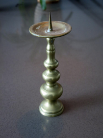
Yes, a candle stick. It looks like something from Cost Plus or India Imports but it was actually given to me my Peter’s mom [Peter Willcox and his wife, Jo, an artist, were in the audience]. Lydia Willcox, we all called her Ea. It’s a long story but when I was sixteen I lived with Ea in a two story stone cottage with a fireplace on Spindrift Road in Carmel Highlands. Ea, for me, was a sort of Auntie Mame. She taught me how to cook, to appreciate classical music and maybe more than that she taught me to stay up late at night drinking red wine and talking about the latest books we had shared, the Hesse novels that were coming out in translation at that time. Ea gave me my first antique, this candle stick. It’s four hundred years old. When I look at it or hold it I connect with all the stories and memories of Ea but I also wonder how many people held this in all those centuries, how many times walked up the stairs with it or read a book at the kitchen table by its light. So it’s a depository of stories and memories. So are all of these paintings, all this art around you. I’m fascinated with time. We all live in a world that’s [snap of fingers], we have two seconds for everything. We walk into a museum and if we take a second to look at something it’s a long time. Our news media, everything [snapping of fingers], we don’t have a meditative time to look at anything but when I look at something like this candle stick I think of all the time and that impresses me, it has a profound influence on me and my work.
I want to talk about another person.
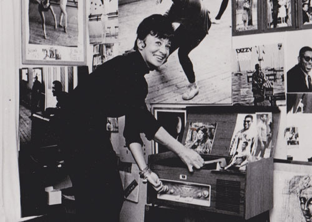
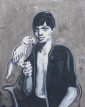
Gunnel von Essen. She was a professional photographer and the still print publicist for Ingmar Bergman, the Swedish film director. I met Gunnel when I was working in a psychiatric hospital in Honolulu in the mid-1970s. She had apparently gone from the airport to Ala Moana Shopping center, took off all her clothes and jumped into the fountain. The police picked her up and brought her to the hospital and that’s how I met Gunnel and we became life-long friends. She was bi-polar and had manic episodes and came from an extraordinary family. When she was manic she often flew to Honolulu because she loved the twelve foot tall pink pineapple wallpaper at the Waikiki Sheraton and loved to swim there. Anyway, at the end of her stay at the hospital she was still not well enough to travel alone so her husband paid me to accompany her back to Stockholm where I got to meet many of her family. Her husband was the Baron Christopher von Essen and his lineage went back to the 13th century. I also met her son, Carl, who was a young adult at that time. One of Gunnel’s photos was of Carl as a young boy with his pet parrot. At some point I decided I wanted to do something with that photo and there is a drawing and a block print and now this painting.
A little more about the process. That painting on the back wall is of August Becker, who was an art professor of mine in 1970. He now lives on the East Coast and August is one of the best living painters I have known. In 1989 he was apartment sitting in Paris and I was able to visit with him for five weeks. It was the 200th year anniversary of the Bastille. August was working on a portrait of his French friend, Brigette, and had simply pinned the canvas up on the wall. One day he was sitting in a chair in front of his painting and the light was falling across him and I took a snapshot. I pulled the photo out recently and decided to do a painting from it. Someone asked earlier which painters have influenced me and Vermeer and his use of light are remarkable. He almost always has his light source falling from the top left. I wanted to use Vermeer’s light in my painting.
This will give you an idea about the process. It’s a painting on canvas and the first step was to do a charcoal drawing directly onto the canvas and then I wanted to begin painting the background and Brigette’s portrait so I used masking tape to set that up.
A lot of artists don’t like to talk about their process because they worry it will demystify it but I don’t care about that at all.
So the next state was to begin paining in the background areas and then, lastly, August sitting in the chair.
Another thing about process. So if you look at the portrait of Calvin, I’ve known him since 1966. Along with August, Calvin is one of the two best living painters I have known.
I worked from a couple of photos I had taken of Calvin.
I did a charcoal sketch directly onto the wood panel but split the face into three components.
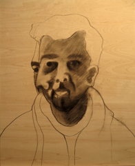
So that is a different process the way the face is split up.
Yes. So I am not going to psychoanalyze Calvin here but I think you realize that all of these portraits are psychological studies. Calvin is interesting in so many ways. He was the life of the party, socially gregarious and eyes turned when he came into a room. There are many facets to his personality. It’s almost as if he has a multiple personality, not in the diagnosable sense, just that there are so many faces to his character.
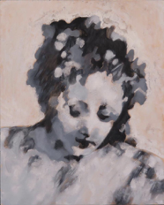
So I’ve talked about painterly painting and the more design oriented painting and how the black and white evolved but one of the things I didn’t mention was that it evolved from my figure drawing. I developed a style over the years of looking at the figure as a landscape of hills and hollows; parts of the body capture the light and others fall into the shadow and they take on shapes that become objects in and of themselves. This is an example of one of the drawings to show you this idea of the body as landscape.
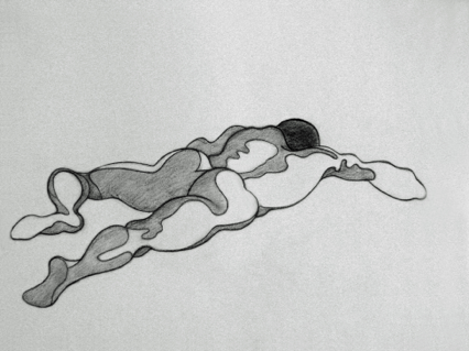
It almost like a puzzle where I am putting the pieces together to create the whole. Hans Hoffman was, in my way of thinking, a “painter’s painter.” He was all about the paint. Very intellectual, he taught for much of his career and one of his teaching principals was something he called “push and pull.” In other words, depth of field, advancing and receding shapes. He did it all with color. The style he developed was abstract, often rectilinear shapes of brilliant color juxtaposed with other color. He might have a square of brilliant red over a ground of emerald green and if you know about color theory you know that what that does is that the red simply flies right off the painting surface at you and the green recedes. So he called that push and pull. I’m trying to do something similar – I’m no Hans Hoffman! – with my hills and hollows approach. Parts of the face come forward, parts recede and it all has to do with the values, the darks and the lights.
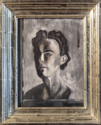
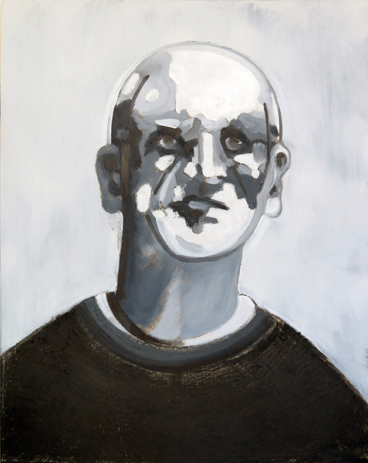
A good example of this can be seen in my portrait of my friend, Terry.
The overall effect, regardless of style, stays consistent. Every one of your pieces has an authenticity that reflects something about these people and something about the world and I think the black and white quality reflects something about that.
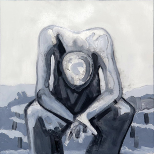
Thank you so much! I’ve finished this series and I needed to break out of it and there is this quote of Dr. King’s – there were others similar quotes of his – and the basic premise is that if you remain silent about the horrible things going on around us you are basically complicit. And there are a lot of horrible things going on around us in this world. Climate change, refugees, gun violence; I could go on and on. So I began to think how could I speak out about that and about two months ago I began a series of paintings I am calling “Existential Threats” and there are already nine paintings and many more in the planning. This one has to do with endangered species.
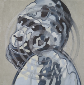
It is rather tame. The one on gun violence is an image of a kid’s Mini Mouse backpack lying on the floor with blood splattered all over the place. But that’s the world we live in, sadly, and I feel compelled to start saying something about it.
So when I look at your black and white series there’s a sort of nostalgia, a kind of looking at memory, but as memories I remember your face but I don’t remember the color of your eyes and so there is this vagueness and, also, when I look out from my own self inside I don’t know what I look like. I think of myself as twenty-three years old or something.
Yeah, I’m twenty-five [laughter].
It seems you are reaching beyond the things that age us but your looking at the person as if…
Well, I have a couple tricks of the trade. I often carry a camera and if I’m meeting someone for lunch I may take photos and most of my friends know by now that if I get my camera out they don’t need to feel threatened. We’re all like this, if someone brings the camera out we stiffen and we pose and we put a mask on and that’s fine but that’s not necessarily who we are and what I’m trying to get at with these paintings is a little bit more of who we really are. So most of my friends are able to relax for the camera. Sometimes I go through a little meditation, have the person close their eyes and walk them through a visualization to get them to relax and empty out their thoughts as much as they can and then I say “open your eyes” and in the first few seconds I take a bunch of photos and I get something more interior. This painting of my friend, Barbara, is a good example of getting inside. She has not been doing well, has a lot of anxiety and has been battling with depression and I think that comes out in the painting. She’s seen the painting and likes it.
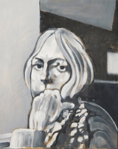
All these people that are real people have seen their portraits and are fine with them. I wouldn’t show a portrait if the person wasn’t fine with it. So, yes, I try to get inside the person, that was the whole idea behind the series. And this is funny. I’ve many times tried to do self portraits and I’ve never been able to get inside as well as I can when looking at someone else.
Thank you all so much for coming!