This month will be Dennis Hanshew’s first duo exhibition with Gearbox, we will remember these truths with Elizabeth Bennett.
Dennis and I joined Gearbox Gallery around the same time last year, and we connected over a mutual interest in the stories an artist tells through their work. Each month, Gearbox members drop off their work for our group show, and Dennis’ work has resonated with me in it’s soulfulness and graphic compositional power. When presented with the opportunity to interview Dennis, I was more interested in surrounding myself with his work and letting the questions come to me rather than following an interview formula. His powerful and stark portraits seem to contain clues to an underlying story, and I was eager to find out more about who his subjects are, understand more about his journey as an artist and how he arrived at his current series. The text below is transcribed from our conversation.
How did you end up working in a black and white limited palette in this series of figurative paintings and portraits? What led you here?
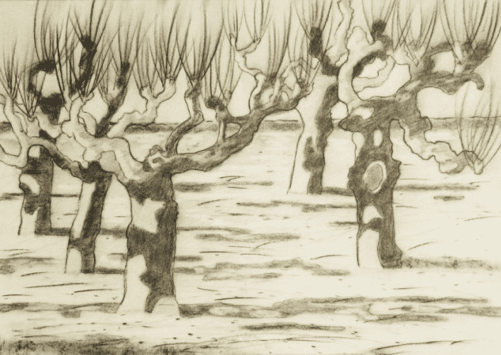
I have always tried to keep up with my figure drawing but I hadn’t painted the figure since my university days in the ’60s and ’70s. For many years, I was doing a tree series, which later morphed into a series of abstract paintings.
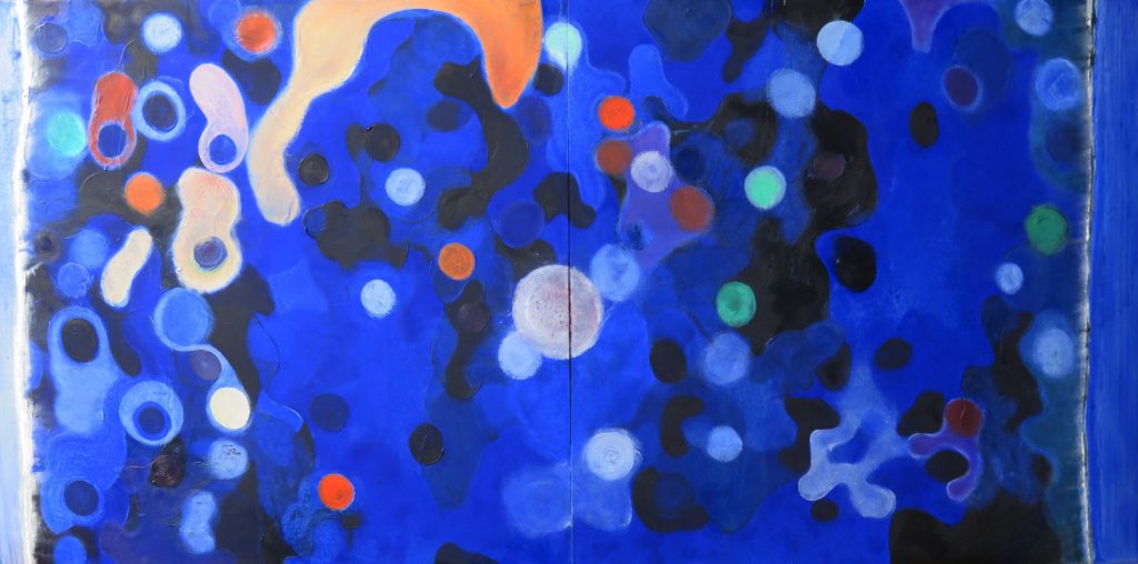
The abstracts in particular, were very vivid, almost hallucinogenic in their color. The last grouping was the closest to pure abstraction that I’d ever come, even though I don’t believe anything is truly abstract. I reached a point where I felt I had “run through it” and there wasn’t anything left for me to explore. A lot of abstract-expressionists ran into that problem. Think about Jackson Pollock’s drip paintings. How many of those could he make? He had nowhere to evolve to after that.
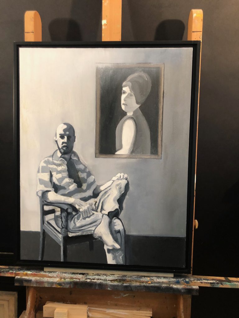
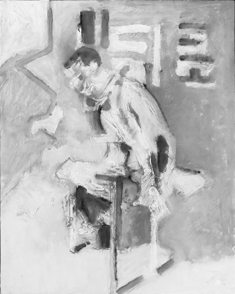
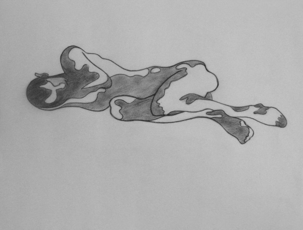
I had nowhere to evolve after hitting that point with my abstract series. I was stymied. I was looking around the internet [for painting images] and I found an image of a man tied to a chair, some sort of torture. I tacked it up on the wall and started to sketch this figure in charcoal. Many of my friends in the past had seen my work at the charcoal sketch stage and said, “Don’t do anything else, just leave it there.” There’s a wonderful graphic design element in a black and white charcoal sketch. So, with this sketch of the man tied to the chair, I decided to paint it in black and white and I was excited with the result. A couple more figurative paintings followed and then I began the portraits. Many pieces in the series are taken from found images that I’ve fiddled with on the computer to play with the contrast and graphic quality.
How long did this series take to develop?
All of the work in this current show was created in the past year and a half. When I retired, I went on a painting binge. At first I was using all common oil paints, because they’re affordable, but I’ve since transitioned to Sennelier oils and it’s like going from a VW to a Bentley. Sennelier has a range of blacks and whites which have added another layer of richness to the work.
So you’ve arrived at a style that’s based on your charcoal sketches, would you say that strategy has made your painting style looser?
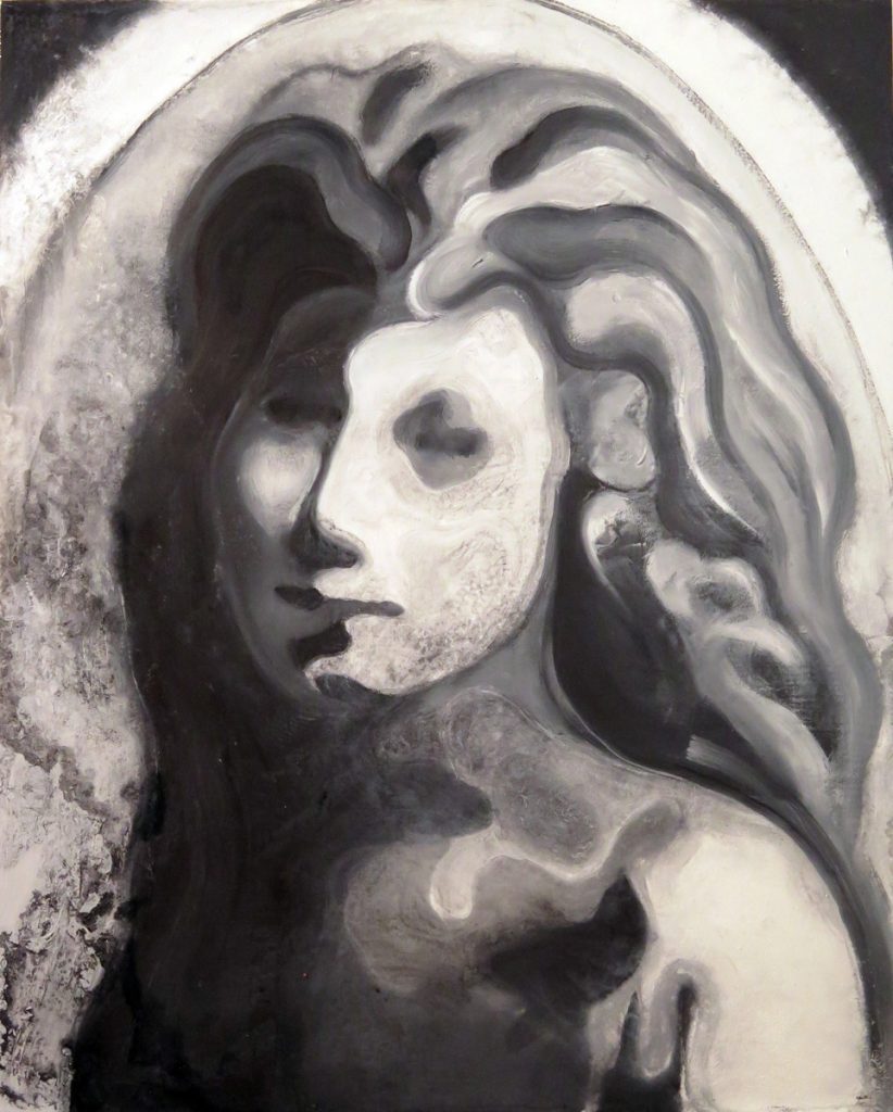
It’s a connection to the graphic design elements in a black and white drawing. My figurative pieces are very painterly. I’m interested in the brushstrokes and pigments and how they move. The process is fast and spontaneous. The portraits, by contrast, are often more studied and stylized. Another compositional element that fascinates me is the linear curve and it manifests in many of the paintings.
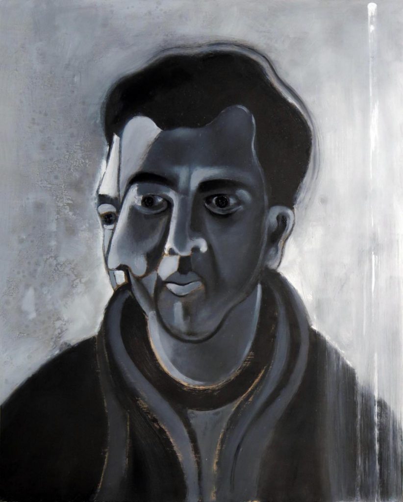
The portraits developed from photos I’ve taken of friends but also from images found on the Internet and elsewhere. One is from a photo on a tombstone of a woman who was quite young when she died and I found the image very powerful.
Once you’ve settled on your source photo, and made the digital alterations, how does the painting process begin?
I always begin with a charcoal sketch onto the painting surface, whether that be wood or canvas. I usually size the wooden panels with gesso but in some I’m painting directly on the wood to allow the warmth of the wood to show through the paint. Between applications of the oil paint I often lay the painting down flat and spray it with terpenoid which begins to dissolve and defuse the pigments. I can then tilt the painting to make the pigments run and recombine or I can work back into them with the brush. It is a process I cannot fully control and sometimes I have to scrub it out and start over. The applications of paint continue and sometimes require several days of drying in between. When I think I have finished the work I then observe it, sometimes for hours, and make adjustments until I am satisfied. I work on one painting at a time and bring it to completion before going on to the next.
I’m interested in how you reduce the photo into simplified shapes in the painting stage. Is that something you plan for digitally?
As I mentioned before, I’ve done figure drawing my entire adult life and I developed a style of looking at the figure as if it were a landscape of “hills and hollows.” When I could afford it, I would hire models and light them heavily from one side. Some of those drawings are highly stylized and created with the curvilinear concave and convex shapes of shadow and light on the body. That style has been carried over into my painting. Very often I will stylize shapes within the body or the face in this manner.
So you’re looking for a very dramatic light source?
Yes. When I take my own photos, I never use the flash. I do enhance things digitally in Photoshop. By using filters you can create shapes of value in the photo. When I work from the photos to the canvas, I can transition the image pretty directly.
Then, it can become more about mark-making.
Yes, and there’s a common misunderstanding that photography is realism. When you look at the photo-realist painters from the ’60s, the concept was that they were trying to mimic reality from the photo as closely as possible. But the reality is the photograph is abstracted as well. Depth of field, dimension, everything is skewed and abstracted. The notion of photography as being representative of reality isn’t quite accurate.
So it’s up to you as painter to decide what to alter and what to embrace within a photo?
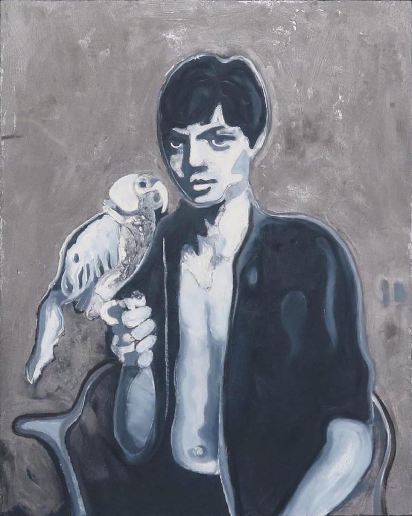
I use photos as classically trained painters used their sketches. No painter pre-photography was competent unless also a competent draftsman. In my recent work I’ve taken photos of friends or used friends’ personal photos. In the ’70s, in Honolulu, I worked at a psychiatric hospital. My four years working there have influenced and informed me in so many ways. I tend to observe people through the lens of behavioral psychology. This is very evident in this series of portraits. While at the hospital I befriended Gunnel, a Swedish patient and professional photographer who had worked as a publicity photographer for the filmmaker Ingmar Bergman. One of my favorite portraits is derived from a photo she took of her son, Carl, with his pet parrot when he was a child.
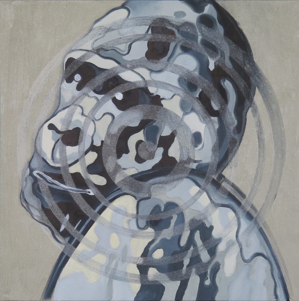
There are some thirty paintings in this series, many of them in this exhibit, and I feel that it is again time to move on. I’ve begun a new series that I’m calling Existential Threats. There are already seven completed paintings, all oil on canvas measuring 24″ x 24″ and all monochromatic; I am still intrigued with the black, white and shades of gray palette. This series is very “dark.” The subjects range from climate change and endangered species to mass shootings. I’m not quite sure how far the series will evolve but, given the current state of our world, there is no shortage of subject matter.