Shapes and Spaces
- An Exhibit at The Gearbox Gallery with Artists Irene Nelson and Sheila Ghidini
- April 30 through June 5, 2021
- Fridays and Saturdays, noon to 5:00 p.m.
This interview was conducted virtually on March 16, 2021 via Zoom.
You are an abstract painter but in my mind I don’t really think there is such a thing. On some level, it originates from some thing, it evolves out of some place consciously or unconsciously. So when I look at your work I see landscape. There is a sense of space and depth of field, even in the small eight-by-eight ones.
I think of them as interior landscapes inspired by the subconscious. The “push and pull” is how I create a sense of space and movement. In the past none of this was intentional. Over the years I have become looser and now I am becoming more intentional and experimental as well.
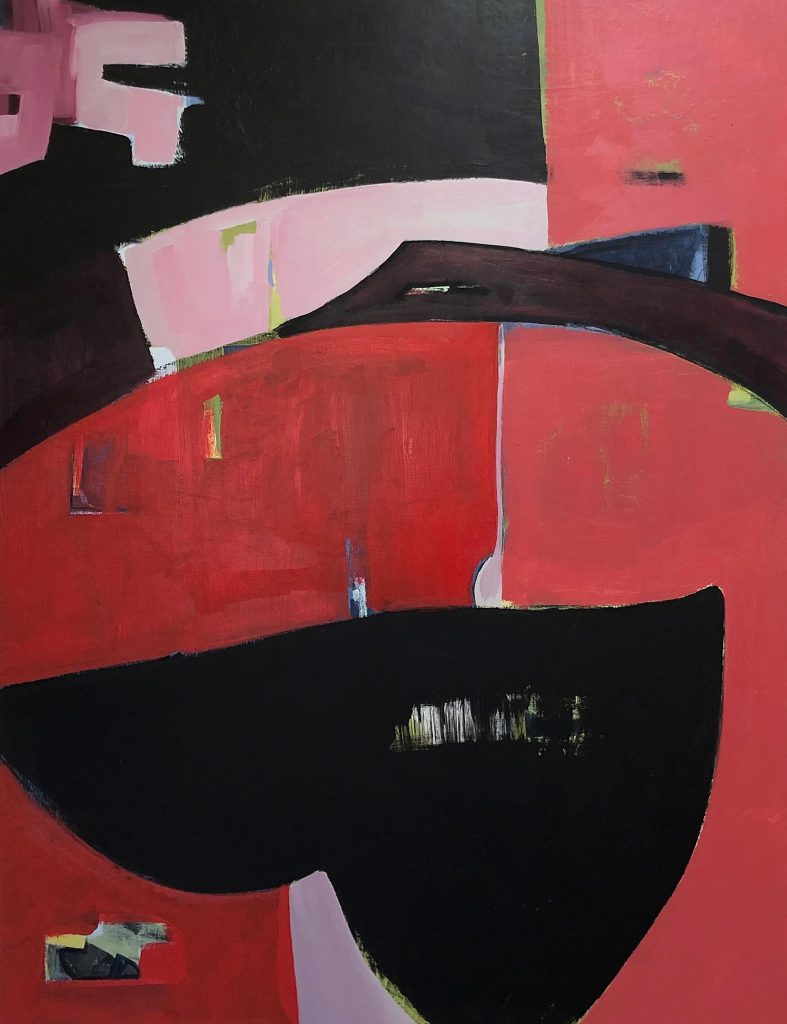
I started making ceramics in a small corner of my studio. It has been very grounding for me over this past tumultuous year. I began to notice that the shapes of the ceramic vessels are finding their way into the paintings. If you look at Heart of Stone, that is the last one for the show and it reflects my environment.
That makes so much sense because your shapes in the paintings have a sense of real volume. (Irene shows me a vessel she has created that very much informs the shapes in her painting and we discuss the interstices between the ceramic pieces and the paintings.)
I want a different look for the ceramics because they are earthy whereas the paintings are usually surprisingly bold. Other than the Sanctuary Series, the names for these large paintings all come from the concept of grounding—the grounding of the work in both ceramics and paintings I made during the pandemic. Being grounded means to have a strong connection with who you are, and the act of creating and making paintings provides that for me.
During this year of quarantine and isolation, do you feel you have come to know yourself better?
I have a strong meditation and Dharma practice which is helpful to me in both my life and my art practice. I felt a lot of support from my practice when we entered the reality of Covid and sheltering in place. Dwelling in uncertainty, change, fear, suffering, as well as joy, connection—this is what it is about.
You already knew yourself but this experience has made it real?
Right. And with Zoom, I have been accessing broader communities and conversations by taking classes and workshops all over the world. I have been studying the Dharma, poetry and art classes from New York, Santa Fe, France, Australia.
I’ve never been able to completely quiet my mind; it’s hopeless!
Itʼs hard. The mind has a will of its own.
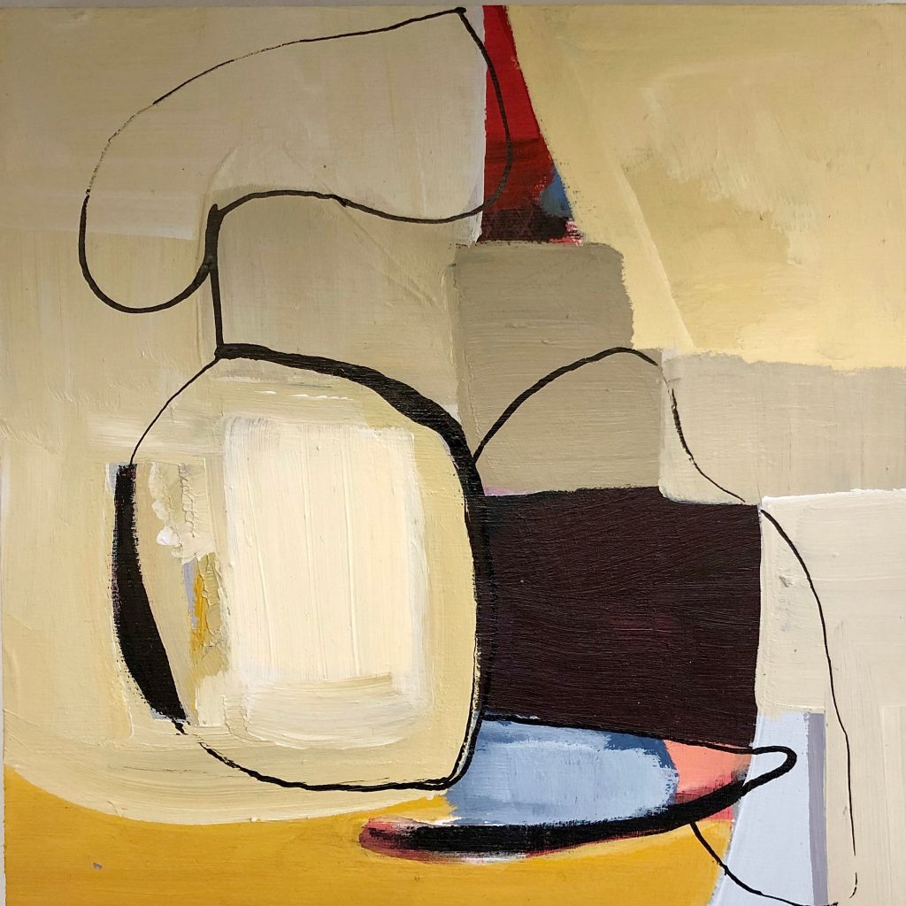
Let’s talk about Heart of Stone. (A discussion ensued about perspective and how I see Ireneʼs paintings as if from a birds-eye-view. She said other people have remarked about that but that she was not aware of it when making her paintings.)
I did a little experiment by taking an image of one of your paintings and rotating it. (We discussed that the painting worked compositionally on all the various rotations.)
Yes, when I am working on the paintings I often turn them.
Let’s talk about your process.
I paint in acrylic on wood panels that are sized (gessoed) white although Iʼm planning to change to black gesso for my next round. I sand them and then come in with various tools such as paint, pencil, charcoal. I make some free form marks—large and small movements in a stream of consciousness as a way to begin. Most often I define a color palette to start with and decide what to keep, what to let go of and what to make a shape out of along the way. I pay attention to new discoveries and happy accidents.
That would imply a different approach when you are working small or large. So when you are working 8-by-8 you aren’t doing body movements, gestures, to make these marks.
Yes, the distinction is very different between the small and large paintings. I prefer working large but it isnʼt always practical. I love working 48-by-48 but the storage is an issue. In this current work I wanted to provide different sizes in the show and carry what I do throughout. The smaller work is harder because I have to be careful not to get too crowded as that is my tendency. I tend to keep adding and adding until I get lost and then I have to begin removing.
So it is a subtractive process?
Yes, I add and add, then subtract until it works for me. But that is not always the process. If we go back to Heart of Stone, I had another painting on that panel for a very long time that was a landscape in blues and greens but it never worked. So I seized the right moment to paint over it in one session. I didnʼt know that it was done but when I looked at it the next day I thought, “That’s it!”
I’ve noticed that the paintings seem to be either warm or cool in color. Is that intentional or something that just happens?
A few years ago I had a blue phase that I couldnʼt get away from and it finally occurred to me that all that work was about swimming but I hadnʼt realized it at the time. (A discussion ensued about value and how certain colors register as dark or light. Irene has sometimes digitally converted a color painting to black and white to better understand the value schemes. She also creates complex color swatches, panels of square shaped areas of color in rows). I have been red and pink crazy since I travelled to India a few years ago. Iʼm doing a number of color studies now hoping to broaden and surprise myself with new color palettes to work with.
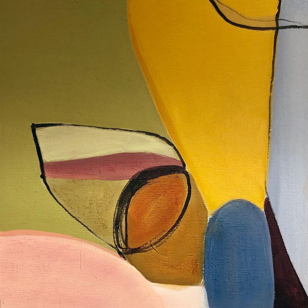
Let’s look at Showing Up.
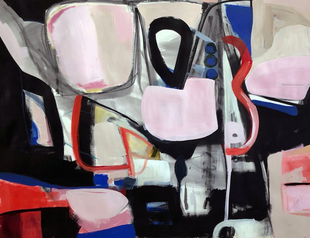
I am fond of this painting because it feels free.
When you mention beginning with a color palette in mind, in this painting it seems like you do not have a specific overall color in mind.
There is pink and black and blue and black. (A discussion ensued about the “push and pull” theory of the painter Hans Hoffman that enables a sense of space and depth of field.) Iʼm not showing all the work I did on paper during this past year. The work on paper feels freer and lighter than the work on panel.
Why is that?
Well, itʼs paper! I bought a lot of paper including a roll of big paper and tons of 18-by-24 watercolor paper. I have been working with ink and watercolor and acrylics—itʼs fun. I want to see if I can translate the freeness and lightness that I feel working on paper over to the paintings on panel. I would like to move towards abstracting the external landscape. For example, Iʼve done some small studies that have a lot more orange, teal, and green in them.
Returning to Showing Up, it is not so much a landscape to me and I also see some references that go back to your earlier painting (from her website, work painted in 2013), for instance those little circular markings. And those marks that look like an elongated numeral 3 and the other that faces it that looks something like a bent arrow.
I know people often like to see familiar objects in abstract work but that is never my intention. I see shapes as opposed to numbers and arrows. The mantra is to just keep going, be calm, keep making marks, keep layering, and keep going; you donʼt know where it is going and it will be okay. This painting came quickly—in three sessions. I have another large paper one that I worked on forever and now I feel it lacks spontaneity.
Those two paintings took a very long time.
I wonder if that is because they are so different from the other paintings?
How so?
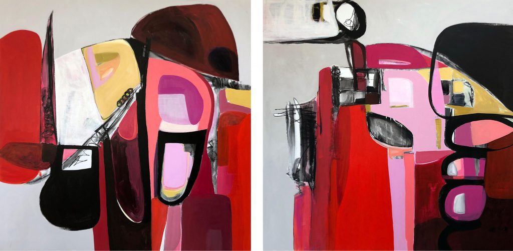
I know that you were a graphic designer by profession and these two paintings are more “graphic” to me. The other paintings seem looser and more fluid. These two are tighter.
I go back and forth. For a while I fought against the fact that I had been a graphic designer and then I thought it best to just embrace it. I like the more painterly ones than the hard-edged ones but these came out and I kept returning to them and fine-tuning. The colors continued to draw me in. When I put the light gray into them I felt it made them cohesive and it was time to stop.
One of the things I’ve learned from all the artist interviews I’ve done is that many of us are in a perpetual struggle to free ourselves from something or some place we don’t want to be.
Yes, and it is so hard.
Yes, and I sometimes wonder, why are we doing this to ourselves? (Laughter.)
We can’t help it! (More laughter.)
The most common struggle seems to be between spontaneity and controlled creating; between intuition and analysis.
One can begin with something analytical and planned but the application can still be free and painterly. It is a fine balance and a very addictive process.
Let’s talk about one of your small paintings (from the Sanctuary Series).
My favorite part in the small paintings is the line work. There are lines underneath that I painted over with shape and then added back in. Many of the lines were made with a twig (using the end of a twig as a painting tool). Other line elements were created by exposing the black of the underpainting. The textural surfaces come from the layering of the paint and I go over them when finished with cold wax (the small ones, not the large works). I work on several at a time and then leave things for a while and come back to them. I need to have a time away to see the work more objectively. I have four to six of them at a time and I keep going around and around working on them.
It’s interesting to me that even though you work on many of them together, they are each so different.
They each begin differently because of the mark-making and then there is an intentional mixing up of the color palettes. I love working on many paintings at the same time. It frees me up. Do that part and then move on. Keep going, then come back. And I sometimes come back to a painting done years ago to bring the work to where I am at now in my growth.
Pick one painting that you want to talk about.
My favorite one is Showing Up, the work on paper, and we did talk about it.
You say it is your favorite. Why is that?
It is the most free and it is about paint. I appreciate putting that red wiggly shape in there and thinking, that’s kind of a crazy thing to do but let’s just do it and see what happens. I like the fluidity of the layers in the painting.
I often refer to painting as either more graphically designed or more painterly. And by “painterly” I simply mean that it is first and foremost about the paint. This painting, Showing Up, is very painterly to me. It is also, in a sense, more purely abstract. I don’t see it as a landscape as I do most of your other paintings.
Yes, it was far more spontaneous and intuitive (in the making) and that, again, has something to do with its size (large) and that it is on paper. I would be happy just painting large on paper but there are logistical problems (framing, surface issues, transporting, etc) that I havenʼt solved yet. I hope I may find some size in between small and large to paint on paper that will work for me.
So let’s visit your Artist’s Statement which is in the form of a poem that you have written.
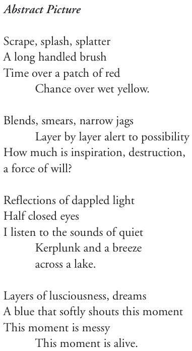
I have several thoughts. One, it reminds me of Japanese Haiku and the longer form of Tanka. Your poem says two things to me. It is stream of consciousness and it is paint.
Yes. I think abstract painting and poetry are kin. I don’t like all that “art speak,” this (poem) is relevant. I’ve begun writing poetry in the last few years and I am getting an education in it with various workshops and critiques.
Does your painting ever derive from or evolve out of your poetry or your written word?
No, but my goal is to have my poetry become more like the intuitive, subconscious process that drives my painting.
I always end these interviews with a question. It is a question I am constantly asking myself and that is, “Why do I make my art?” Why do you?
I do it because I have to, because my next painting is going to be my very best painting, and because it’s an addiction. I am happy when I paint. Period.