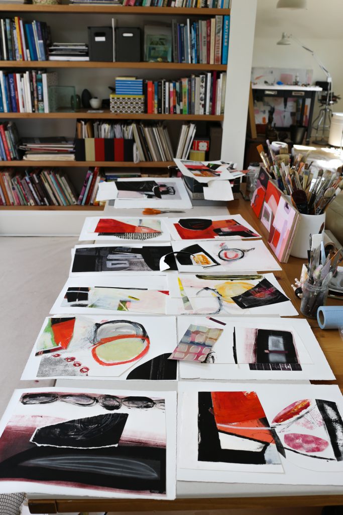
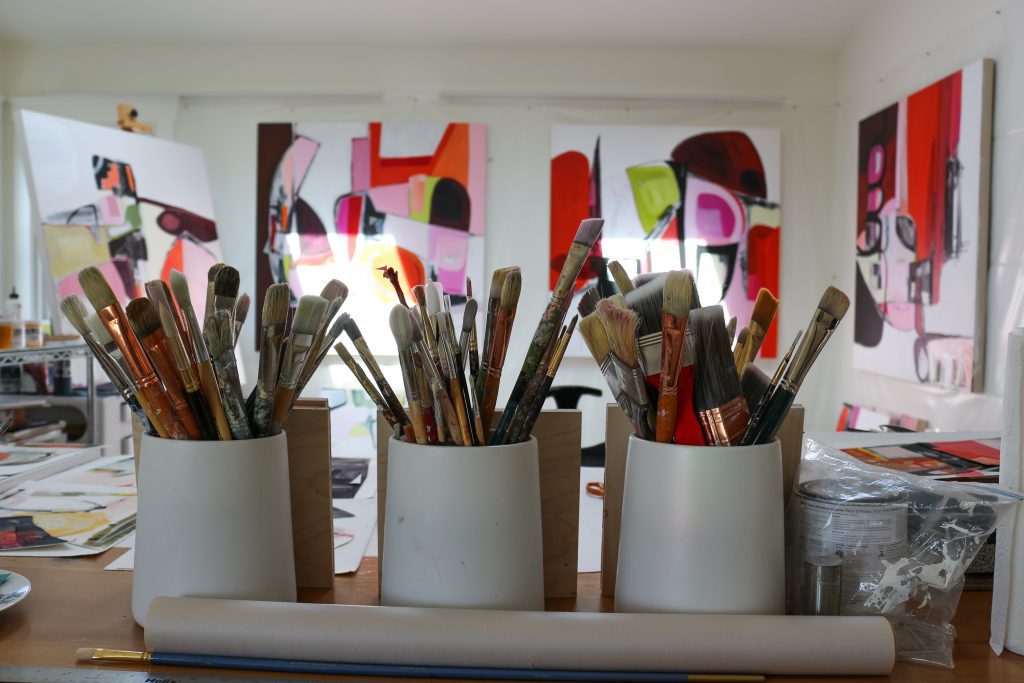
I had the wonderful experience of seeing Irene’s light-filled studio space recently as she prepared for her Gearbox feature show Spaces Between. Studio visits are so enjoyable because I get to peak into the books, materials and organization systems that make finished artworks possible.
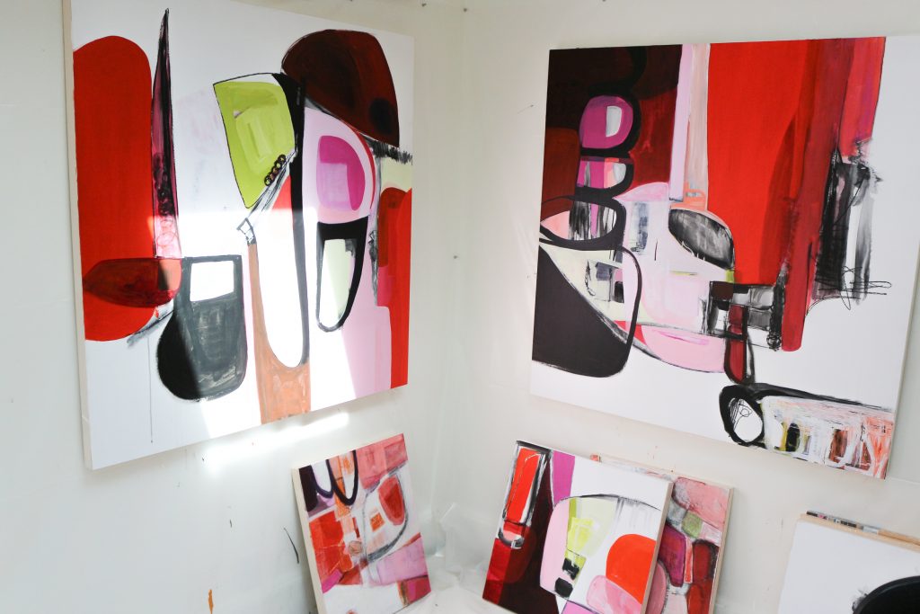
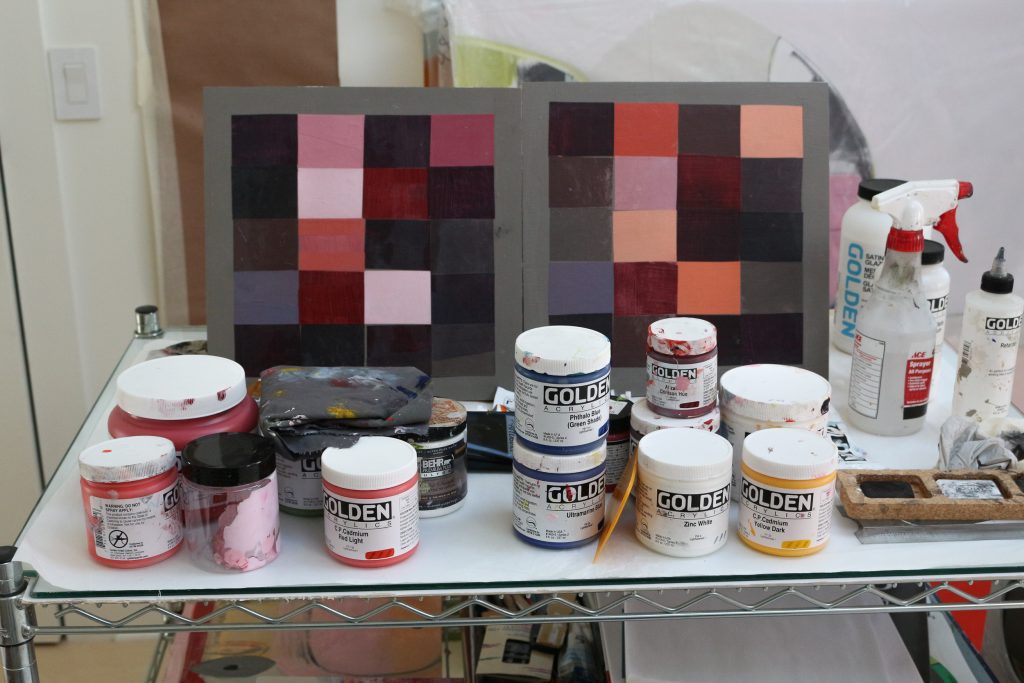
Irene’s studio was filled with these fascinating glimpses. For her recent series, she started with a color mood board that seems to set the tone for her entire body of work. Inspired by her recent trip to India, the rich and bold hues create an emotional impact that’s explored throughout her recent paintings. Nelson’s background in design, offset printing and photography is evident in how her work teeters between clear systems and free-form experimentation.
As she has transitioned away from a demanding career in graphic design into a studio practice as a painter and printmaker, Irene has explored ways to reconcile her design aesthetic with her love of the painterly surface. In this new work, sweeping forms that seem to echo the arc of an arm movement create tension with and sometimes collide with intimate drawn marks. Color fields read as an assertive expanse from across the room, but invite the viewer in with their flickering nuances; luminous membranes of color revealing the surface beneath. Broad brushstrokes seem to define their forms, but also seem to threaten to bust out of their drawn enclosure. With this visual language Irene is both paying homage to her rich design background but exploring new possibilities in paint. View Irene’s new series of works on panel at Gearbox from October 17 to November 16th. See more of her work online at irenenelsonart.com.