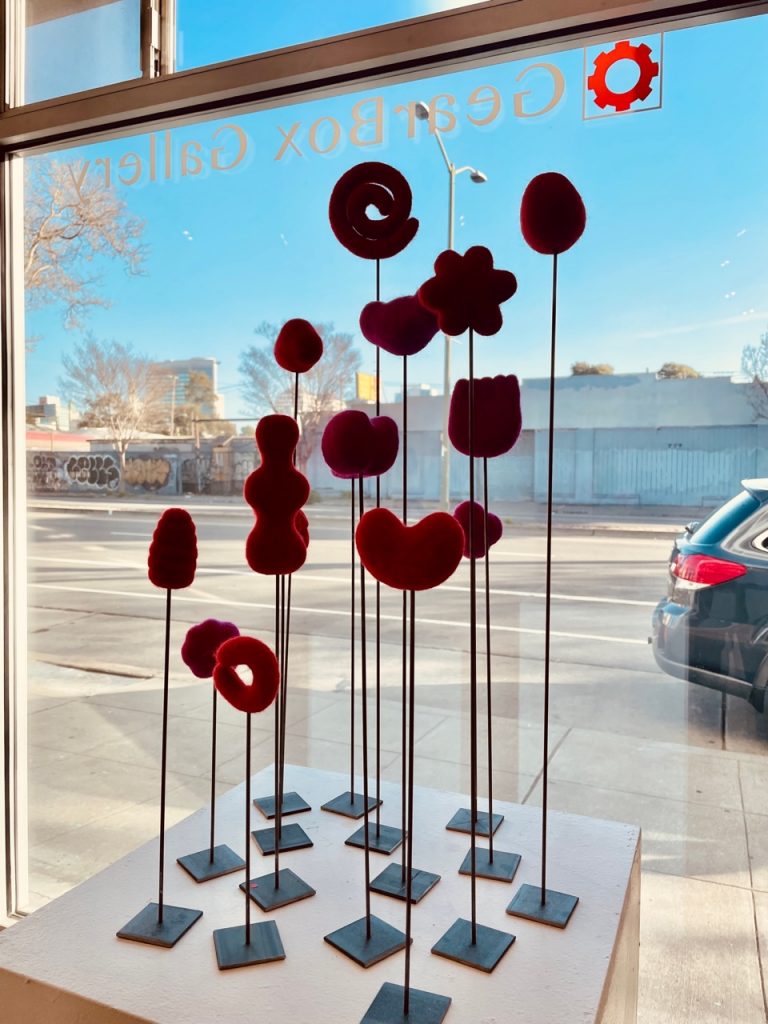
Patricia Sonnino’s feature exhibition with Michele Foyer All You is Brimming is on view at Gearbox through April 30, 2022.
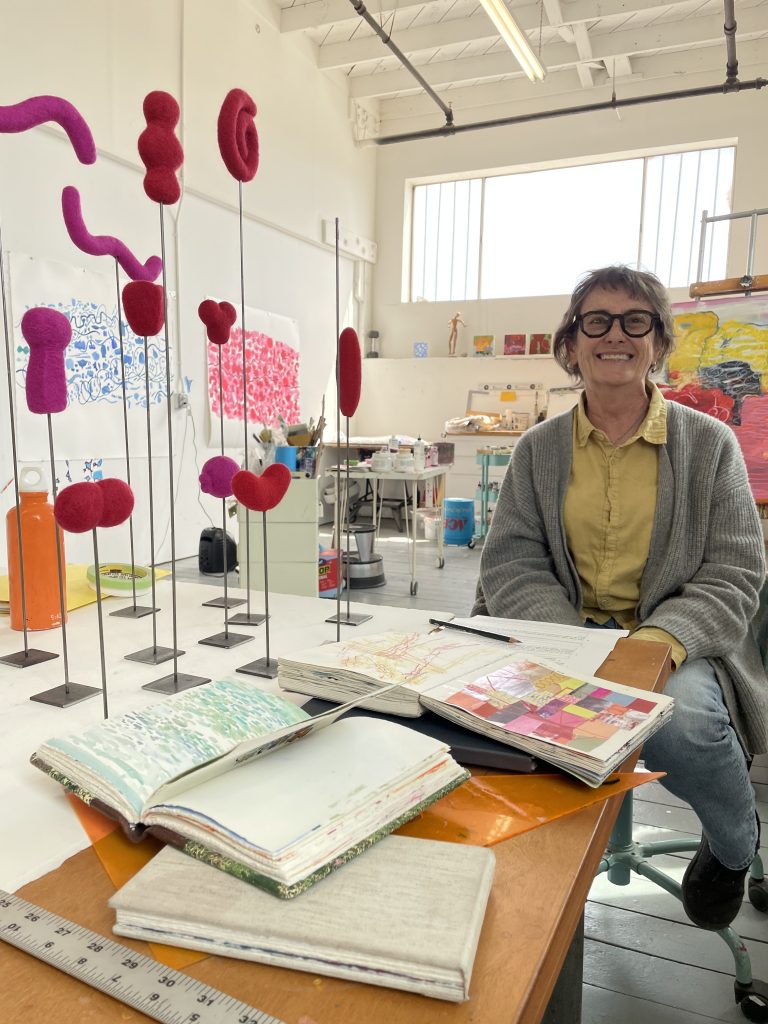
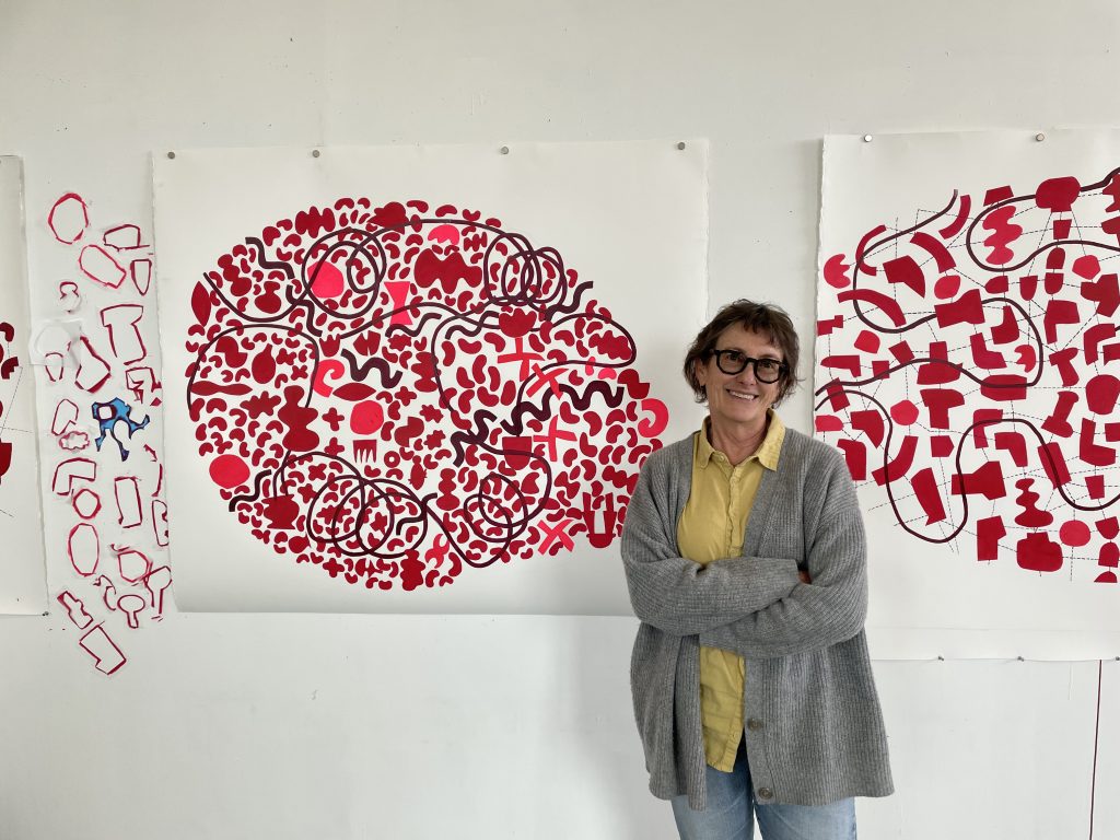
As I drove over to Patricia Sonnino’s studio in San Francisco, I was reminded of how Soninno approached interviewing me last year and that our roles are now reversed. It’s a ritual–revealing one’s workspace and process to another artist. Of all of my colleagues at Gearbox, I thought I had the strongest understanding of how Soninno works (we both work in acrylics, in abstraction, on panels)… yet her work is also mysterious to me. In preparing for the interview, I revisited her social media posts over the past year, and reflected on what I had seen in person in the member shows–bold and precise shapes that seem to glow from within. Surfaces that range from high gloss to deeply absorbed matte washes of color–this is the Patricia Sonnino I had known.
Yet, just from the previews of her new work on Instagram, I knew she had made a significant and brave shift in her studio practice. That bravery and exploratory force was everywhere in her massive studio. Annotated color swatches, piles of sketchbooks and prototypes for new work in sculpture. Yet, among the varied experiments, the unifying visual experience is Red. Red of every imaginable intensity, hue and tone. A few other color explorations were also present, but the pulsing family of reds were clearly the star of the show. Through her works on paper and sculpture, Sonnino approaches her studio practice through a balance of free-form instinctive moves, and methodical experiments. She’s willing to explore a path, only to back out of it to return to a previous idea but with new skills gained.
As I spend time with her new series, I feel I am in the presence of a burgeoning language that’s just beyond my understanding. Or a map that’s beyond my capacity to use, yet still entices me with clues.
Here is an excerpt of our conversation from Sonnino’s generous and awe-inducing space. My questions are indicated in bold text.
I’ve been following the sketchbook work you’ve posted over the last two years with great interest. Can you talk about what role your sketchbook studies have played in your recent work?
I really like sketchbooks, and I always carry one around with me or when I travel. I always have one. And part of what I like about them is they’re unselfconscious. If you get a nice piece of paper which you’ve paid a lot of money for, it becomes more precious. Even if it’s paper, it sometimes feels like the drawing needs to work, but when you’re doing it in the sketchbook, there’s no pressure.
Plus, it’s private. Sketchbooks aren’t usually something that end up in a show or are anywhere. So it feels like the sketchbooks are just for me. In the studio they’re warm-up practices, some of them I take them on vacation and artist residencies. When I went to the Vermont Studio Center, I was using the time to explore color palettes. I was using my sketchbook to make graphs of color palettes for paintings as I was making them. I would make a color wheel and say, instead of primary yellow, primary red and primary blue, I would use Yellow Ochre, Burnt Sienna and Payne’s Gray or something like that. And so I would start painting with these weird color mixtures.
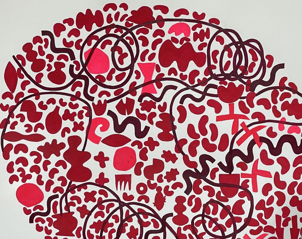
More recently, I began cataloging shapes in my sketchbook. I was making these maps that included shapes, a little bit of background and repetition of lines, almost like a tempo. I think unconsciously, that influenced what is happening in my larger work.
Much of the work you’ve shown at Gearbox so far has been very pictorially full, and not many open spaces. Your new works on paper show a keen awareness of the space between shapes, seeming to give each shape a symbolic meaning as if it were a pictogram. What have been your guiding strategies in making these compositions?
I’m not sure that I even had a strategy. It just happened. I think I consider this work on paper to be a kind of drawing. And drawing to me, is fundamentally different from painting. I can only explain it that way when I work on paper. The paper has to take part in the drawing. Paper White is warm and soft and has a wonderful quality. And I think working on paper demands that I allow it to participate in the piece. So open spaces in this work are important. This whole series came out of an idea of a crowded mind with thoughts appearing and disappearing and connecting and disconnecting. I felt like it was hard to focus during the pandemic.
How did your deep exploration of red develop?
I started using a watercolor made by “A Case for Making.” As the studies developed, I just decided this body of work should be all about red. I used every red available to me. Some pieces contain variations on just one or two reds, some have all the reds. There’s only so many reds in acrylic paint. The paint needs to be watery in this way of working. I guess [the paintings] are more luminous that way.
One of the most memorable visual elements in your new work for me is the wandering line that snakes throughout the cluster of shapes. What do the lines represent for you?
The black lines are mapping the clusters of shapes. Then I wanted a counterpoint. The composition of shapes have a figure-ground relationship and my initial connecting lines provided structure. I added the whirling lines for movement, to carry your eye and exceed the map.
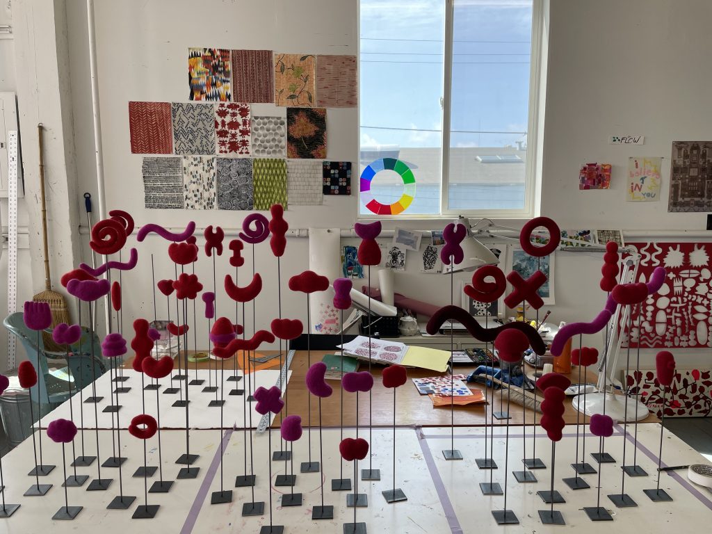
Your new body of work includes sculpture! How did the three-dimensional work come about?
The idea for the sculptures began with my wanting something that jumped off the page. So, at first I was thinking I could cast them in glass, but I didn’t have the technical knowledge. Then I thought I could make a hanging screen out of the shapes. I thought maybe I’ll have these laser cuts hanging from the ceiling, but they would still be pretty flat.
Finally, I arrived at the possibility of felt. I watched a video about how to felt, and I thought, wow, this is probably something I can deal with. The felt shapes take a long time to form, but it’s something you can do on your own without a lot of specialized tools. The next challenge was figuring out how to display them on really tall and skinny rods that would move around and when you touch them. I started plaster casting experiments. Eventually I settled on steel for the rod material and returned to metal bases (my original idea). I’d found a blacksmith to work with.
I was fascinated to learn about your career in architecture. Has there been any cross-pollination between your architecture practice and your fine art practice?
Part of it is that painting needs to have a different mindset from design. I need my mind to be in a flow. In design, you have to develop a flow, but there’s a long road getting there. Learning your problem, understanding your restrictions so your mind can flow with your hand. With painting, I’ve had to turn off my designer brain to get there…but I’m not sure it’s really true. Design is really 3-d… you’re looking at paper and making 3-d things. It’s a very visual hand to eye practice. You really learn how to see scale and relationships. When I was practicing architecture, I was the color person. I like to think of the buildings I designed as paintings. I like to work around things to get to them. Work around the paintings – expand them into other things.
Your current Gearbox exhibition title All You is Brimming is quite evocative! Where did the title come from? How did your exhibition partnership with Michele Foyer arise?
When I went to UCross, I lent her my studio and she sent me a photo of one of my paintings next to her work… and that was the spark. The title came from conversations from Michele – whirling thoughts during the pandemic. All You is Brimming – speaks to overflow, of feeling overwhelmed.